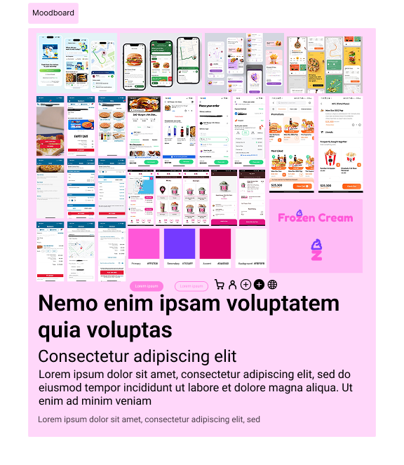
Developed as an independent design exercise, FrozenCream is a concept aimed at elevating the digital experience of ordering and browsing artisanal frozen desserts. The project began with moodboard research and sketching wireframes to explore aesthetics and layout, followed by scalable wireframes of increasing fidelity. The end result was a Figma prototype that simulated ordering flows and visual delight—providing a tangible vision for future usability testing and client presentations. The methodology used in this project was Design Thinking.
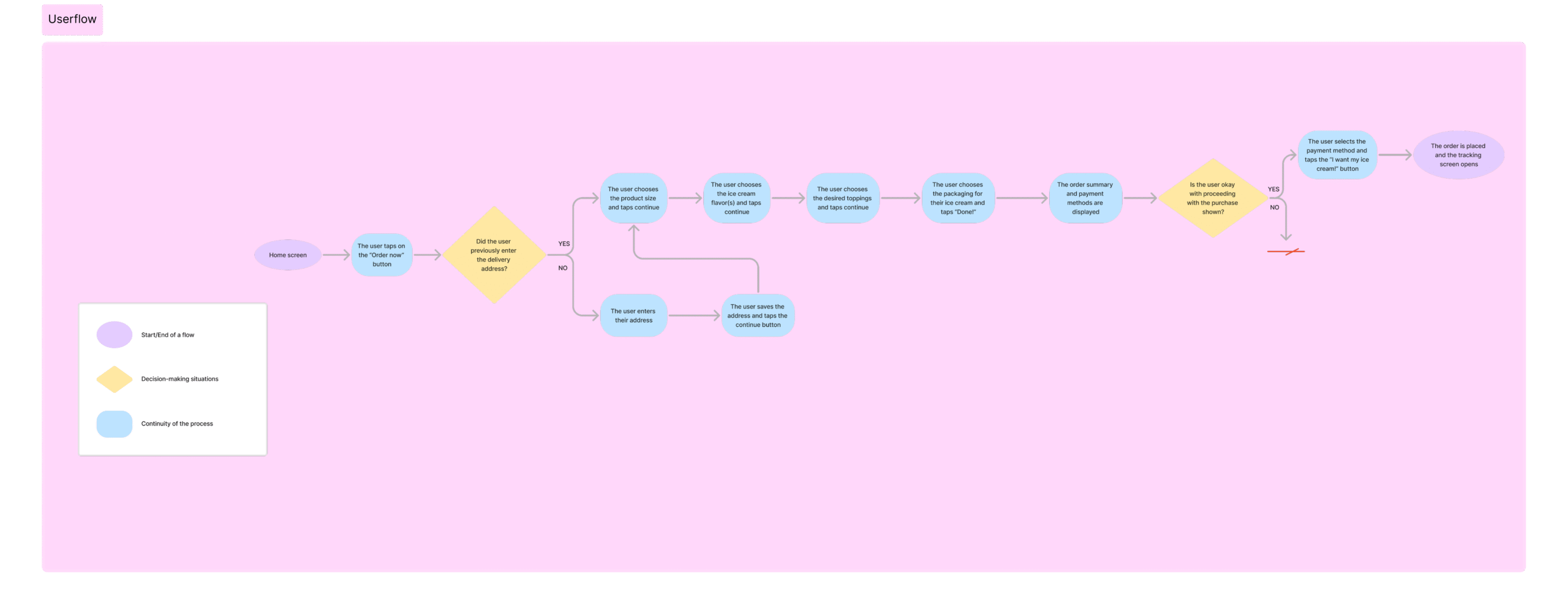
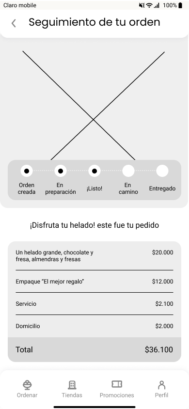
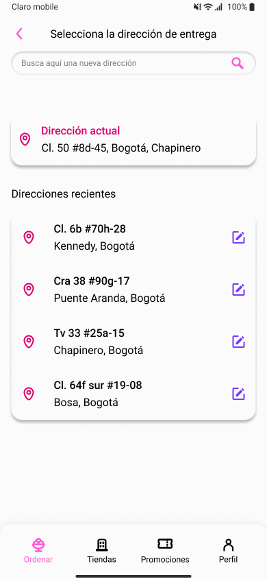
-
Defined user personas and mapped customer journey
-
Created moodboards to set brand identity and mood
-
Sketched concepts and designed wireframes (low–high fidelity)
-
Iterated layouts to improve browsing and ordering flows
-
Built an interactive Figma prototype with triggers and hover effects
-
Target audience: People and families looking for a personalized, high-quality ice cream with home delivery.
-
Key principles: Accessibility, user-centered design, and an intuitive ordering experience.
Business Understanding - Ice Cream Market Overview in Colombia
- ”Consumers are increasingly interested in high-quality and flavorful products, which has driven the demand for artisanal and gourmet ice creams.”
- “Ice cream shops are increasingly focused on creating unique and unforgettable brand experiences, through the decoration of their stores, the presentation of their products, and the creation of events and themed activities.”
-
"The consumption of ice cream has grown by 90% in the last five years, which is why different companies have begun to bet on this market with innovative ingredient proposals."
-
“According to the Cali Food Chamber, the market for healthy snacks in Colombia has grown by 14% since 2015 to date. (...) Within this market, healthy dairy products represent 32% of its value, including yogurt ice creams”
-
The ice cream market in Colombia has gained great relevance in recent years. For the creation of a brand and an innovative application, it is essential to incorporate unique, healthy, and differentiating ingredients. In addition, it is key to offer a unique experience, whether through themed activities or through a creative and striking presentation of ice creams.
References:
Benchmark
| Company | Baskin Robins | Rappi | Domino's | Didi |
| Initial Navigation | New promotions, flavors, and the option to start an order are displayed. At the bottom, there’s a navigation bar with options to order, see stores, coupons, and payments. | Several options are displayed to place orders: restaurants, types of food, promotions, and suggested restaurants. | Two options are displayed: “Create a new order” or “See my orders,” with a video background and a top navigation bar that includes a hamburger menu. | Several options are displayed to place orders: restaurants, types of food, promotions, and suggested restaurants. |
| Order Flow | The delivery address is requested, a store is selected, the menu is opened, the product is chosen, toppings and containers are selected, added to the cart, and finally, checkout is completed. | The restaurant is entered, the product is selected, added to the shopping cart, and then checkout is completed. | Upon opening the menu, a predefined flavor or one built from scratch is chosen. Then, the order is added, sent to the cart, and checkout is completed by confirming the address and reviewing the purchase summary. | The restaurant is entered, the product is selected, added to the shopping cart, and then checkout is completed. |
| Address and Delivery | Before placing the order, the address is requested. There’s also an option for in-store pickup. | Shown before placing the order to display nearby stores. | Shown before placing the order, login is required, and checkout is confirmed. | Shown before placing the order to display nearby stores. |
| Differentiating Value | Wide variety of flavors and excellent product quality. | Exclusive Rappi promotions and various options available. | Personalization, freshness of ingredients, and flavor. | Exclusive DiDi promotions and various options available. |
| Product Personalization | Only allows customizing ice cream flavor, toppings, and container. | Not customizable; depends on the restaurant. | High level of personalization. | Not customizable; depends on the restaurant. |
| Payment Process | At checkout, the ice cream price is highlighted, with an option to enter a coupon. A breakdown of all charges is shown. Then, the payment method is selected. | The purchase summary is shown, and the payment method is chosen (credit/debit card, cash, or Rappi points). | The purchase summary is shown, address confirmed, and payment method selected (credit/debit card, cash). | The purchase summary is shown, and the payment method is chosen (credit/debit card, cash). |
-
Users seek fast and hassle-free experiences, so an optimized user flow is crucial to maintain their interest.
-
Personalization increases engagement and satisfaction. Customizable options should be provided, and changes should be displayed in real time to improve the experience.
-
Users need an order summary to know what they are buying (costs, promotions, delivery times) before confirming payment—this increases the conversion rate (users who complete the task).
-
The visibility of promotions encourages purchases. The app should place offers in visible areas of the initial design.
-
Platforms allow users to choose delivery details, such as saved addresses or pickup points. The app should include flexible scheduling options.
-
An aesthetic, clean, and clear design improves product perception and navigation ease.
-
A variety of payment methods should be offered—this increases the likelihood of purchase.
-
Navigation should have a clean and hierarchical layout. The app should include a fixed navigation bar with clear sections (Home, Promotions, Cart).
-
Product variety is increasingly important to users. Healthy, gluten-free, vegan, and innovative flavor options should be included.
Moodboard
Sketches

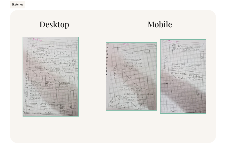
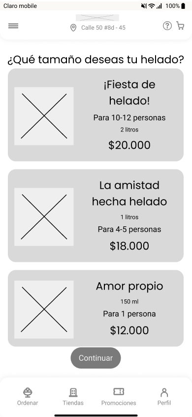
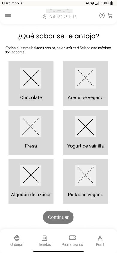
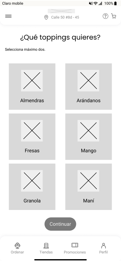
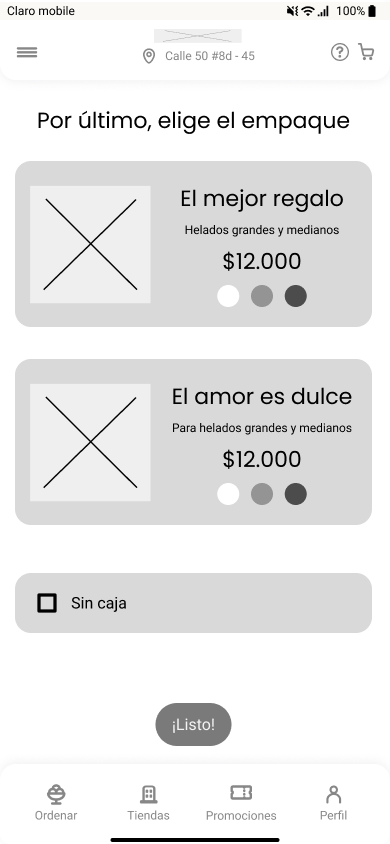
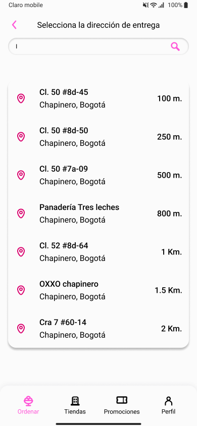
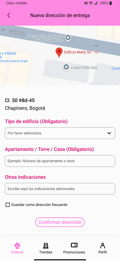
I produced hand-drawn sketches for both web and mobile versions to quickly outline the information architecture and navigation flow. These early drafts facilitated the exploration of solutions, and the prioritization of features.
Medium fidelity wireframes
UI Kit

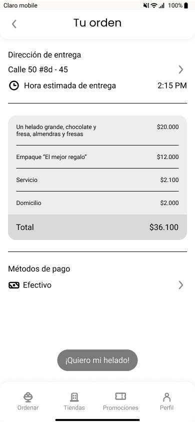
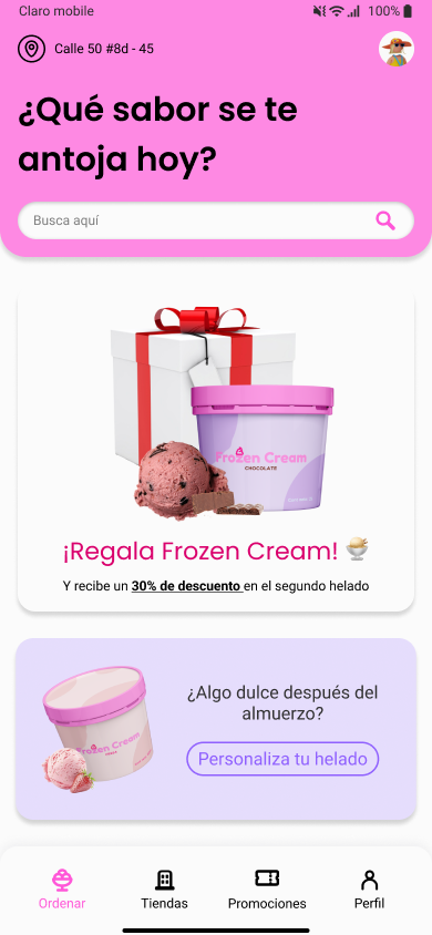
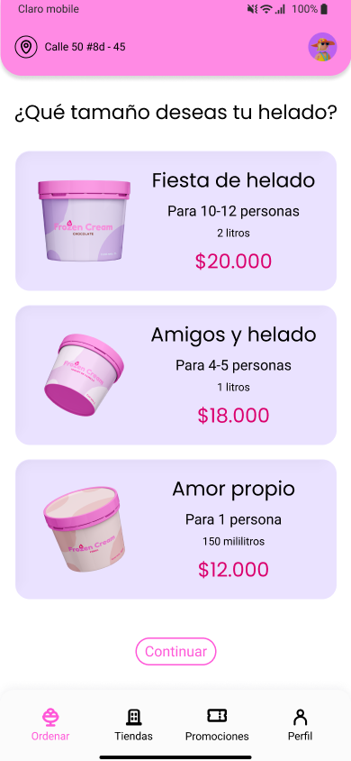
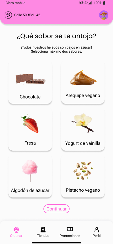
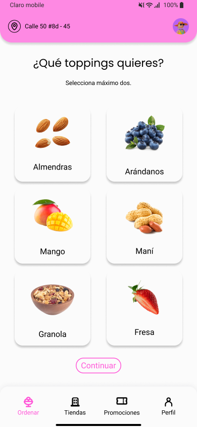
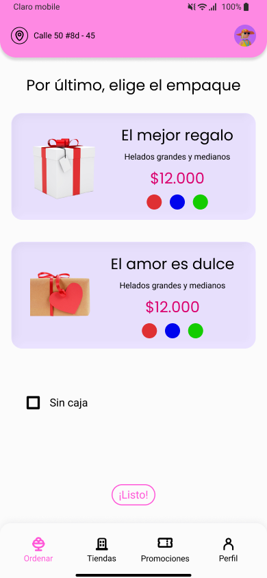
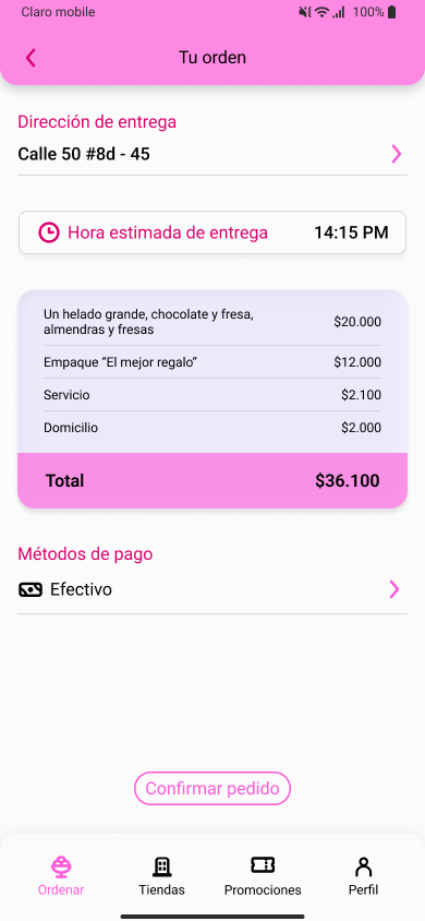
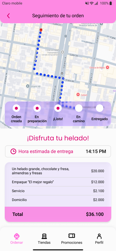
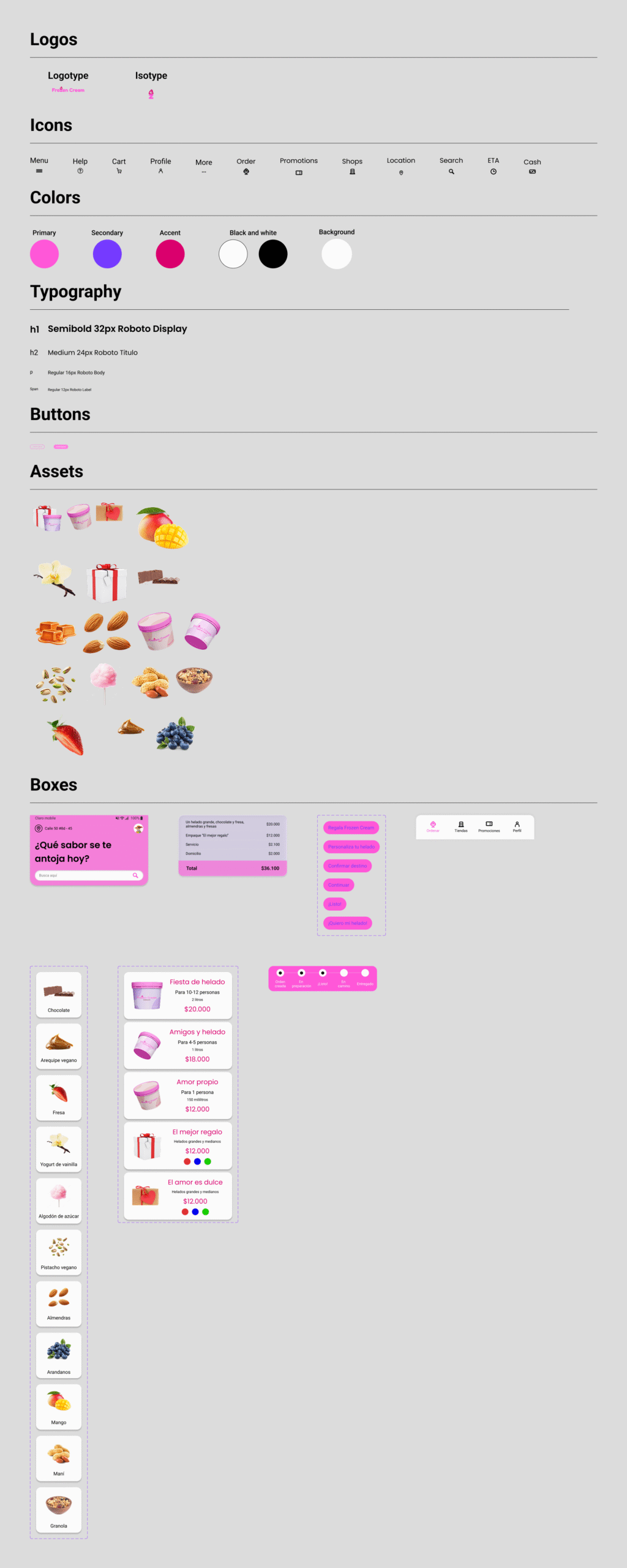
I developed a UI kit including design guidelines (logos, colors, typography, buttons, assets, and icons) to ensure visual consistency and scalability across the platform. This component system streamlined the transition from wireframes to the interactive prototype, ensuring coherence on every screen.


