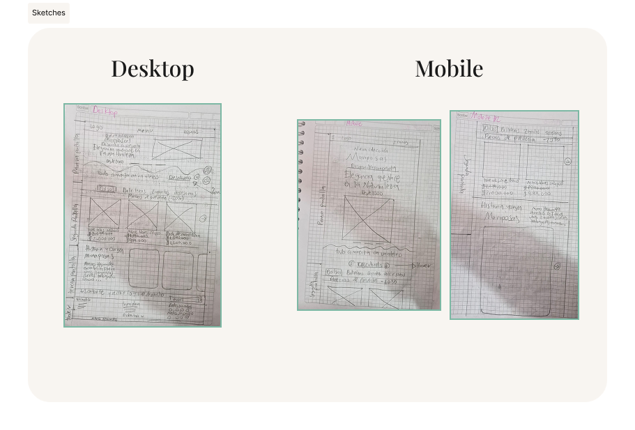
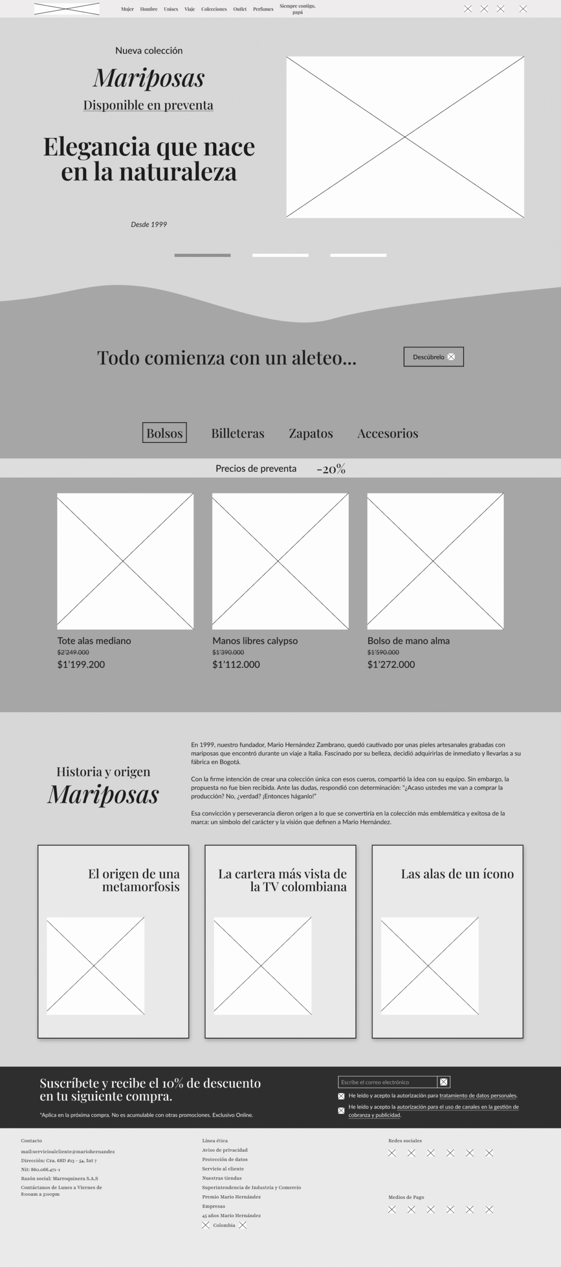
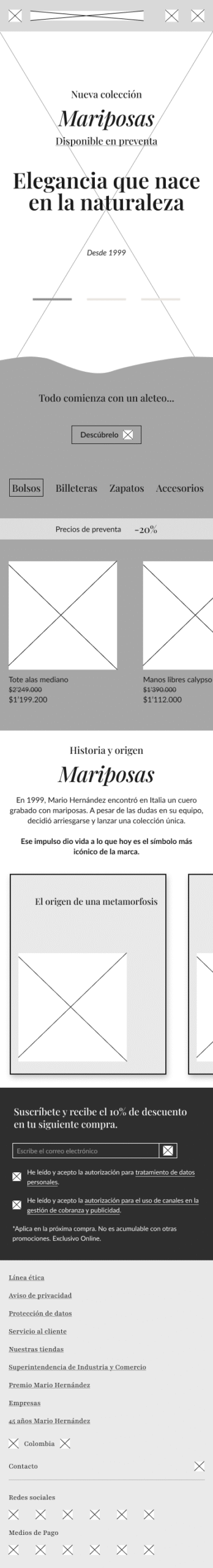
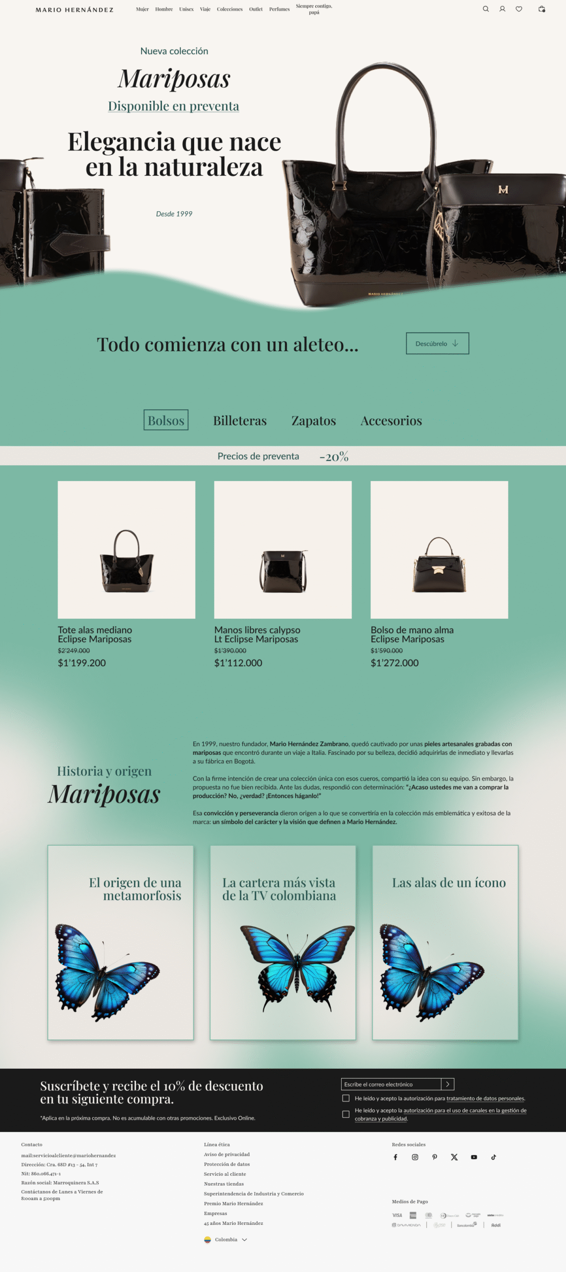
In the Mario Hernández brand concept project, I focused on designing a high-end e-commerce experience that reflects luxury and craftsmanship. Beginning with brand-driven moodboards, I sketched initial layouts, then built medium- and high-fidelity wireframes to emphasize product storytelling and visual appeal. The resulting Figma prototype presents refined interactions—image zooms, smooth transitions, and emphasis on craftsmanship—to provide an immersive shopping experience aligned with the brand’s identity. The methodology used in this project was Design Thinking.
-
Defined user personas and built moodboards to shape the brand narrative
-
Sketched layouts to explore hierarchy and brand identity
-
Designed wireframes from low to high fidelity for product showcase and navigation
-
Developed interactive prototypes, and conducted usability testing through Maze
-
Refined visuals to strengthen luxury aesthetics and engagement
-
Built an interactive Figma prototype with zooms, transitions, and storytelling
Desktop prototype
-
Increase the click-through rate (CTR) on key components
-
Promote the “Mariposas” collection
-
Improve the browsing experience on both mobile and desktop
-
Jerarquía visual clara: Z-pattern y contraste de tamaño para dirigir la atención.
-
Narrativa progresiva: Uso de scrollytelling para revelar contenido de forma dinámica.
-
Consistencia tipográfica: Playfair Display para elegancia, Lato para legibilidad.
-
Identidad de marca reforzada: colores, fotografía y textos conectados con la historia de la colección.
Heatmaps analysis
This project was developed as part of a selection process. For the challenge, I was provided with user behavior data (heatmaps and navigation metrics), which I analyzed in order to propose improvements to the brand’s digital experience.
Users primarily interact with the first products visible when landing on the page. As they scroll down, attention decreases significantly
Larger elements attract more attention and receive more clicks.
In the main navigation, the most frequently used sections are Women, Outlet, and Men. Regarding the header icons, search, profile, and cart are all used frequently and almost equally.
Heuristic Analysis
✅ The cart, profile, and search are visible in the header and frequently used.
⚠️ However, there is no clear indicator of the user’s current location in the navigation (the active section in the menu is not highlighted).
✅ The language aligns with the brand: familiar terms are used.
✅ Users have options to filter from the menu.
⚠️ Navigation relies heavily on scrolling, which is problematic since less than 10% of users reach the bottom.
✅ The visual structure is coherent in terms of colors, typography, and photographic style. ⚠️ However, the hierarchy is not well distributed.
✅ The search bar should provide autocomplete suggestions to reduce input errors.
⚠️ There are no error messages when a search returns a product not available in the catalog.
✅ The menu offers clear categories.
⚠️ Sections are not interconnected, making it harder for users to reach the bottom of the page
✅ There are shortcuts to the user profile and favorite products.
✅ Elegant design consistent with the brand’s luxury identity.
⚠️ Large elements attract clicks but push potentially important content (e.g., featured products) further down.
⚠️ Excessive use of banners may create a sense of visual overload without adding clear interactivity.
⚠️ If a product is unavailable, there should be immediate feedback in the navigation.
⚠️ Contact information is located at the bottom of the page, which few users reach.
-
The current design works well in capturing initial attention, but the structure fails to retain users until the bottom of the page.
-
Proposed solution: It is necessary to reorganize the content hierarchy and enhance the storytelling to maintain user engagement. My approach includes: 1. Applying a Z-pattern layout, since the page is highly visual. 2. Using accent colors to guide user focus. 3. Reducing the size of the main banner to highlight other key content. 4. Adding a scrollytelling narrative, combining visual dynamism with brand storytelling.
-
The user seeks status, heritage, and exclusivity, so the content should emphasize exclusivity, the artisanal processes behind the products, and highlight the Colombian legacy, reinforcing the cultural and national design identity of Mario Hernández.
-
The brand identity communicates luxury, nature, and tradition, but it needs to adapt better to the digital context. While the platform conveys elegance and exclusivity, it currently feels somewhat monotonous and struggles to hold attention for long. By introducing a more dynamic narrative and an optimized hierarchy, the user’s interest can be sustained without losing the essence of the brand.
Design and Identity Analysis

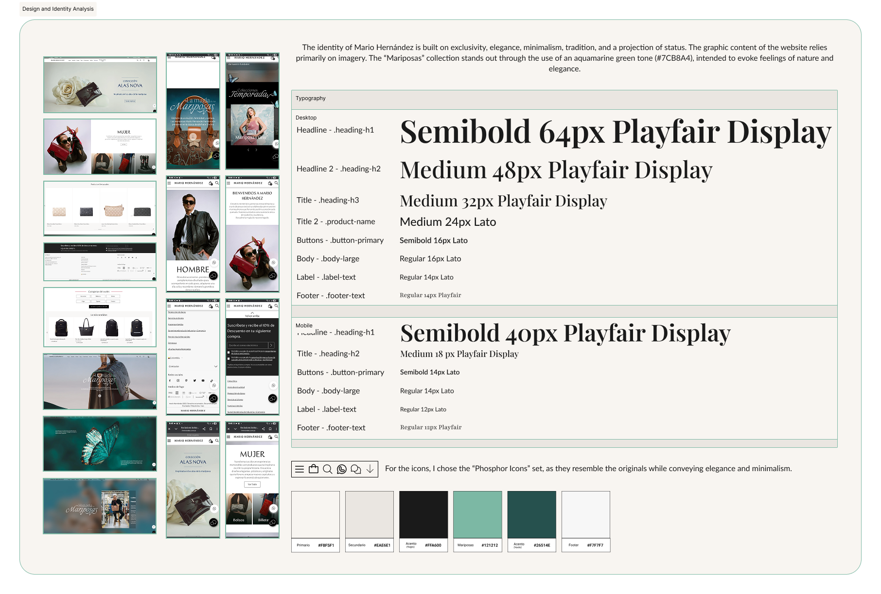
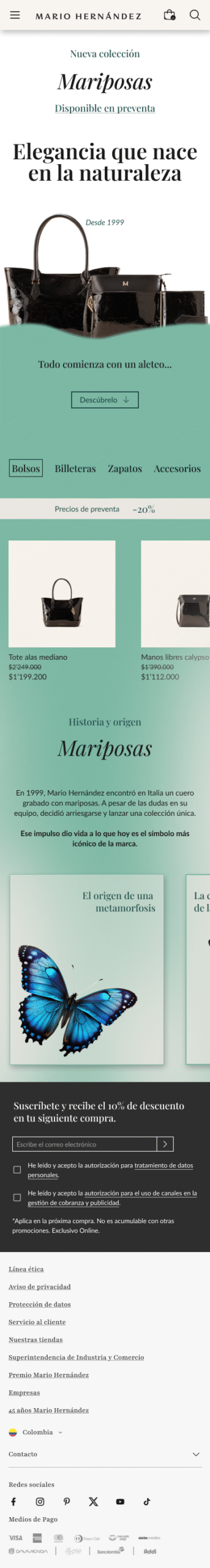
In this project, I conducted an analysis of the visual and digital identity of the luxury brand Mario Hernández, focusing on the Mariposas collection. The study covered typography, color palette, iconography, and overall visual style, highlighting how the brand conveys exclusivity, elegance, tradition, and status. I defined the typographic hierarchy for desktop and mobile (Playfair Display and Lato), the primary and accent color palette (with emphasis on the aquamarine tone #7CBAA4 to evoke nature and sophistication), and selected the most suitable icon set (Phosphor Icons) aligned with the minimalist and elegant aesthetics of the brand. This analysis helps to understand the visual coherence of Mario Hernández’s identity and provides a foundation for proposing digital design improvements aimed at strengthening the visual narrative of the collection.
User persona

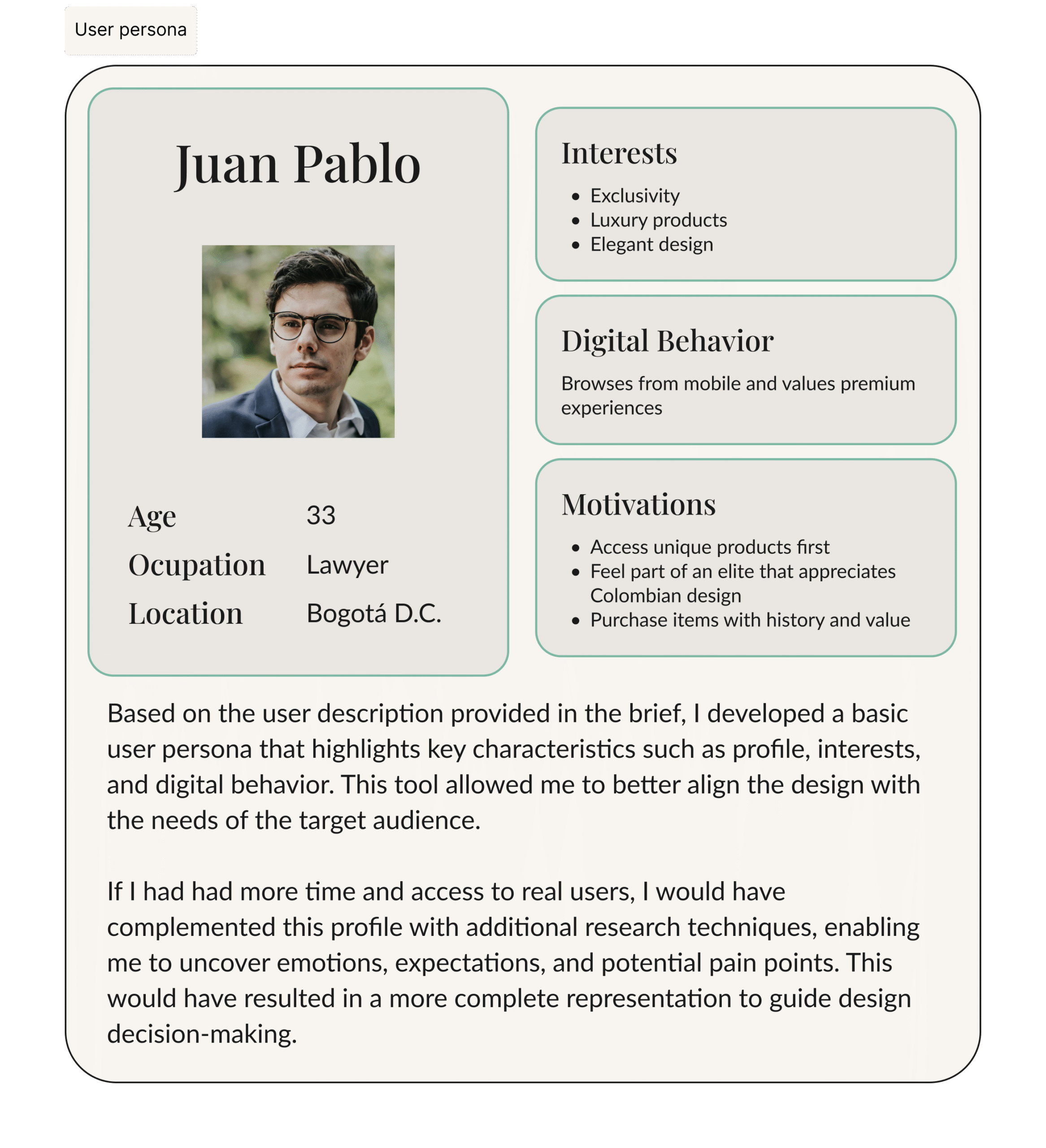
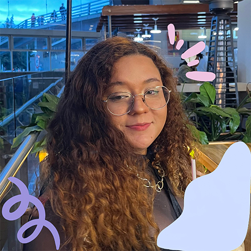
As part of the user analysis, I created a basic user persona based on the description provided in the brief. This profile highlights key characteristics such as age, occupation, interests, digital behavior, and motivations, helping to better understand the target audience’s needs. The persona, Juan Pablo, represents a customer who values exclusivity, luxury products, and elegant design. His digital behavior focuses on mobile browsing and seeking premium experiences. His motivations include accessing unique products first, feeling part of an elite that appreciates Colombian design, and purchasing items with history and value. This tool allowed me to align design decisions with the end user’s profile. With more time and access to real users, I would have complemented this persona with additional research techniques to uncover emotions, expectations, and pain points, resulting in a more complete representation to guide the design process.
Sketches
At this stage of the project, I created the first paper sketches to explore the structure and visual hierarchy of the interface for both desktop and mobile versions. These sketches allowed me to define the layout of key elements (menu, headers, product sections, and call-to-actions) and outline the initial navigation experience
The main goal was to establish a clear visual foundation that would support the transition to digital wireframes, ensuring coherence between both versions and maintaining a design that adapts consistently to the brand’s identity.